Rethinking Kredmint’s loan application flow
Redesigned the loan application experience to make it intuitive, transparent, and frictionless, incorporating user feedback and thoughtful UI improvements.
Company
Kredmint
Duration
May - Aug ‘25
My role
Solo Designer
About Kredmint
Kredmint is an all-in-one financial partner offering loans, bill payments, and gift cards. With ₹1000+ crores disbursed and new services launching, more users are joining every day.
My role
As a solo designer I drove strategy, led 0–1 design, conducted research, crafted copy, and ensured quality control through to execution.
The problem
😕
User problem
Applying for a loan felt confusing and heavy.
Excessive information on forms caused user anxiety.
Users grew frustrated and struggled to complete applications.
Many relied on support and sales teams for help.
Staff workload increased as a result.
🏢
Business problem
Inefficient loan application design causes high user drop-offs.
Low conversion rates impact business growth.
Operational costs increase
Lost revenue opportunities emerge.
Business struggles to scale efficiently due to process inefficiencies.
Go back
Go back
Why was this issue important to solve?
1
Competitive landscape
Loan onboarding is often a user’s first real interaction with the brand. A clunky, confusing experience makes users question the company’s credibility and reliability with money.
Sales teams were spending unnecessary time hand-holding users instead of focusing on high-value leads.
2
Direct business impact
Every drop-off meant a lost loan application. If users couldn’t onboard, they never entered the funnel — which directly hit revenue.
Sales teams were spending unnecessary time hand-holding users instead of focusing on high-value leads.
3
User trust & perception
Users often hesitate to share financial documents online without clear signals of legitimacy or security.
Transparent communication and familiar trust cues (like progress visibility and verified partner mentions) help users feel safe and confident to proceed.
How does loan application journey in Kredmint works?
Stories I heard

Ravi, runs a cloud kitchen. I thought applying for a loan would take 5 minutes, but the form had 20+ fields in one go. I just gave up because I wasn’t sure if it’s legit.
“

Fatima, was fine entering my details, but suddenly it asked for my bank login. No explanation, no security message. I didn’t continue — I can’t risk my account like that
“

I submitted everything, and the screen just said ‘Success’. Success what? Did I qualify? Will someone call me? I felt like I was waiting in the dark.
“

Amit, a first-time applicant, gave up halfway after seeing 20+ fields. He wasn’t sure if he had the right documents ready — or how long it would take.
“
Key insights
👀
People said they want to know things upfront
I didn’t know how many steps were left, or if I had all the documents ready. It felt endless
👀
It’s a lot of forms — feels like opening a bank account all over again
Users perceive budgeting and gaining insights into cash flow as essential components in enhancing their financial well-being and working towards achieving their financial goals.
👀
Why should I trust Kredmint?
Many users entering the loan journey feel uncertain because Kredmint is new to them. They hesitate to share documents or complete the process since they’re unsure whether the platform is safe,
Refined problem statements
😕
Problem #1
How might we make clear for the before starting the loan application so they feel informed, confident, and less likely to drop off?
Lack of context before application
No clarity, no confidence
Thrown into the process blindly
Starting application without understanding
Context gap in onboarding
😕
Problem #2
How might we guide users smoothly through loan application onboarding by making progress tangible & set clear next steps?
High friction across steps
Confusing inputs, low guidance
Progress felt invisible
Lack of trust and safety
No feedback upon completion
The goals were clear
🔽
Reduce drop-offs across steps
❤️
Build early trust & transparency
🧭
Guide users with contextual help
✍️
Simplify complex input fields
🎨
Change the visual design
🏁
Setting clear next steps
Design approach & principles
✨
Clarity Before Action
Users feel more confident when they understand what’s ahead. We provide upfront context so actions feel intentional and reduce uncertainty.
📋
Guided, Step-by-Step Flow
Interfaces should minimize friction and cognitive load, allowing users to focus on what matters without unnecessary distractions.
🚀
Actionable Feedback
Users should always understand the outcome of their actions, with clear feedback that guides their next steps and reinforces progress.
👂
Learning from people in direct contact
I gathered insights from customer care representatives about common user challenges in the loan application.
Understanding users
🧐
Setting context
I began by setting the context of the problem space, understanding how users interact with the loan application process and what the business aimed to achieve.
🤝
Understanding the loan proces
To build empathy, I first mapped out the entire loan application journey and studied the “why” behind each document we were asking users to submit.
🎨
Adapting the research approach
Since major flow and interface issues were already identified, I focused on quick design iterations and usability testing.
Old user interface
Application progress states

Overall impact of this
53%
users initiating loan application journey
21%
Less calls to customer executive on what is this product actually
Solutioning
1/2
How to give right context to new users before starting the loan application onboarding journey?
Solutioning
2/2
How to make the loan application more intuitive that more people complete the application flow?
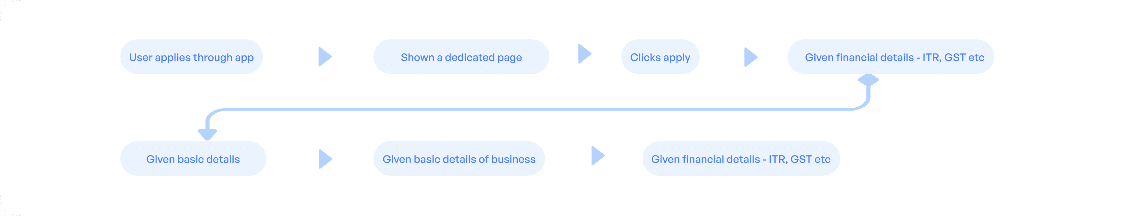
Mapping user mental model
Users expect quick, simple flows, but the reality is often long and complex. Bridging this expectation–reality gap by mapping what is the expectation vs reality and making the experience intuitive and trustworthy
1
Applying for a loan should be quick, and feel like a short form maybe a 5-minute form.
2
Someone (like a bank agent) will guide user step by step, with clear buttons and progress shown.
Expectation
1
Instead of a quick form, user was hit with 20+ fields, unclear questions
2
The user is thrown directly to fill out the details which causes user anxiety and gap in that story.
Reality
Exploring the solutions
I started iterating the solutions after doing a deep dive into the problems users were facing. Each iteration was an attempt to simplify the journey, reduce points of friction, and create more clarity at every step.
But...
After the release went into production, I spoke again with users and agents. My main goal was to carefully understand their perspectives and capture detailed feedback on how the new loan application flow was performing in real scenarios, and whether it truly addressed the pain points identified in earlier iterations.
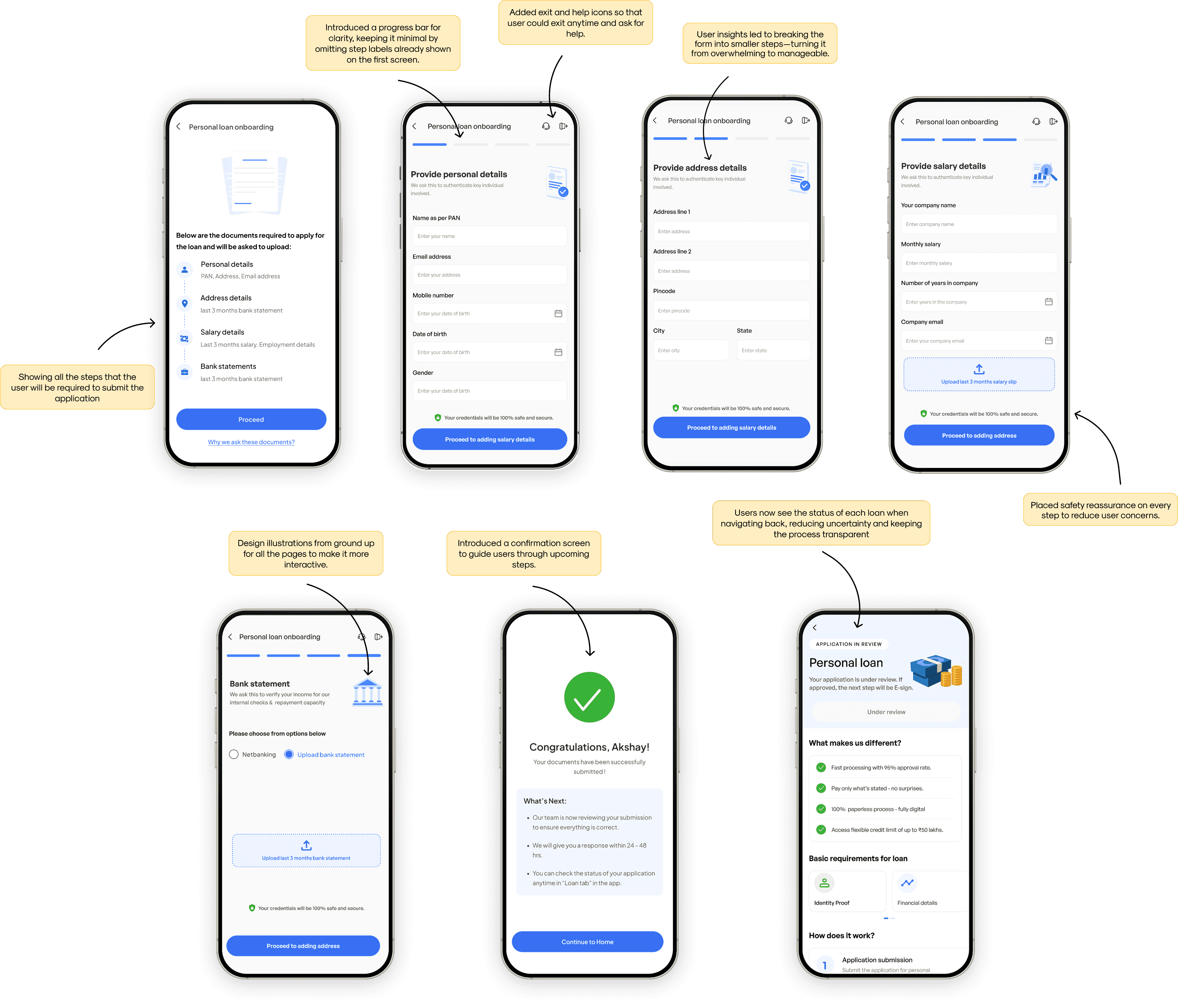
Solution 1
✅ Most viable as per user insights
I made the first iteration as per the insights I got from the users. The form is made in such a way that the user can fill out one detail at a time. I also designed the input boxes with clear titles to make it easier for users to understand.
Solution 2 / Final design
✅ As per the new user insights
In this iteration, I made the changes as per the new user insights I got, of keeping users engaged and excited at every step. So I added a screen where uses can
see the progress they are making .
Problems
Form Overload & Clutter
Information Overload
Poor visual hierarchy
Use of a bad typeface with makes readability tough
Use of light text color, making it extremely difficult to read and understand.
Key results
Overall impact of this
71%
Drop off rate
45%
Applications successfully submitted
What I Learned
🗣️
Clear communication reduces friction
When users clearly understand each step, they feel more confident and are less likely to drop off mid-journey.
Transparent communication about purpose and next steps builds trust and reduces hesitation
👂
Listening to users reveals invisible blockers
Direct conversations with users and people dealing directly with users uncovers pain points.
These insights helped prioritize design changes that genuinely solved user frustrations instead of just surface-level UI fixes.
💬
Always thinking from the mental model of the user
Designing with the user’s mental model in mind helped align the flow with how they naturally think
This approach made the experience feel intuitive—we could predict the users next step and understood the process without extra explanation
❓
The problem statement
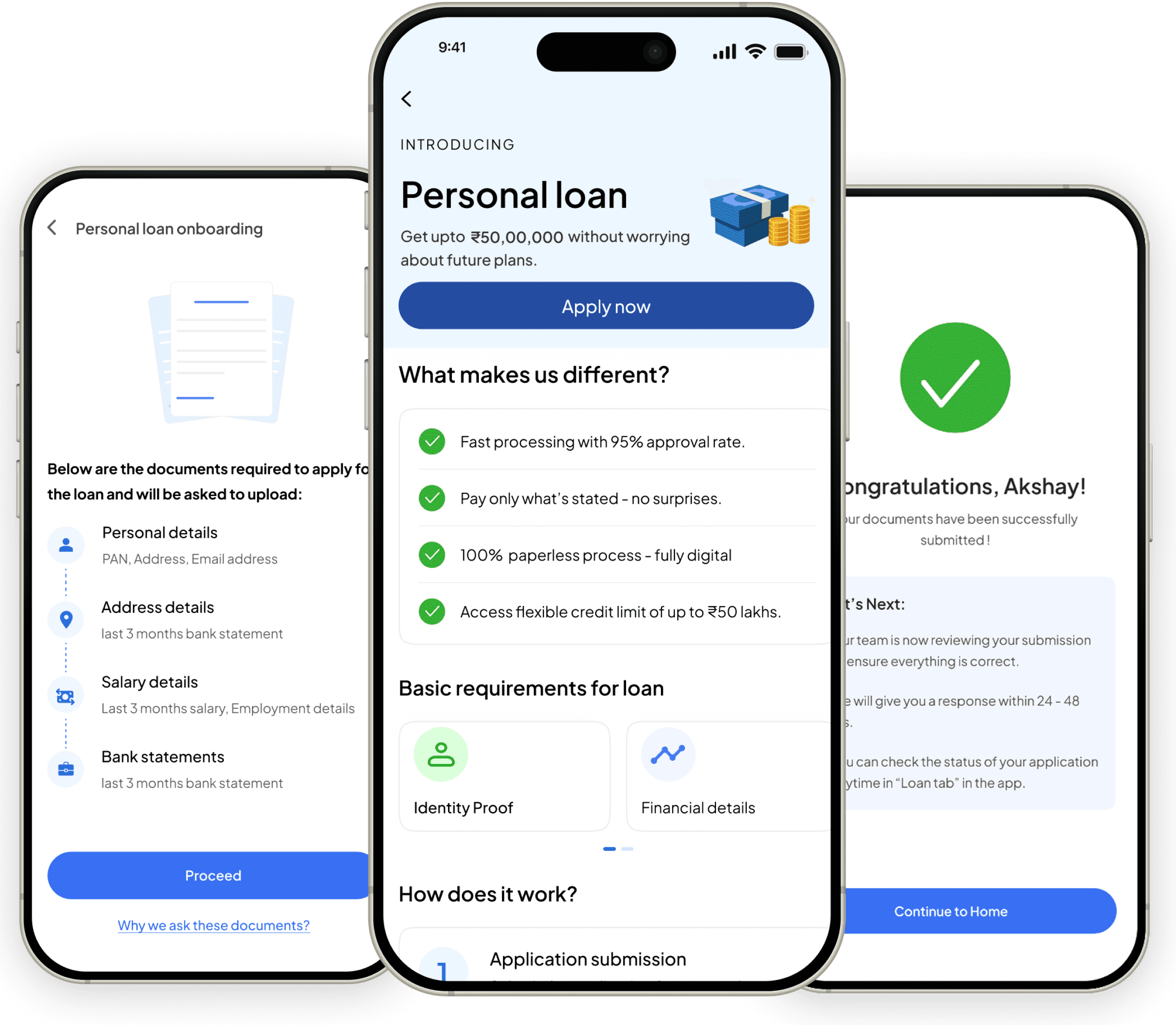
The problem here was that new users upon triggring the loan for eg personal lona from the app, thrown into the process blindly without making the user understand the what, why and the how of the loan
💡
The solution
We introduced an entirely new real estate which will be trigger when the user has chosen a product from the home screen. Core job of this page was to give insights of loans and convince user to choose to apply for the loan application in Kredmint.
❓
The problem statement
New users starting a loan (e.g., personal loan) were dropped straight into the process.
They weren’t told what the loan was about, why it might help them, or how it worked.
This left people feeling lost and unsure about moving forward.
💡
The solution
We introduced a new screen that appears once a user selects a loan product from the home page.
The goal of this page was to explain the loan clearly—what it is, how it works, and why it’s useful.
Its job was also to build trust and motivate users to start their loan application with Kredmint.
❤️🩹
Positive Shift
The journey felt smoother than before.
The overall flow was seen as more streamlined.
🔧
Areas to Refine
Users noted a lack of personalization.
The experience still felt like it could be more engaging and enriched.

✨
Positive response to the redesign
Users appreciated the redesigned flow and UI changes, finding it cleaner, more structured, and easier to navigate. The improved visuals and step-wise approach gave them a stronger sense of control and confidence throughout the process.
📉
Significant reduction in users calling agents for help
Users appreciated the redesigned flow and UI changes, finding it cleaner, more structured, and easier to navigate. The improved visuals and step-wise approach gave them a stronger sense of control and confidence throughout the process.
✨
Increase in number of loan application receiving to underwriting team
Users appreciated the redesigned flow and UI changes, finding it cleaner, more structured, and easier to navigate. The improved visuals and step-wise approach gave them a stronger sense of control and confidence throughout the process.