But what happens when Kredmint adds more products in the future?
↔️
Introduce a top-level segmented control
We’d add a horizontal segmented tab at the top of the Home screen (e.g., “Loans / Vouchers / Bill payments etc”). This keeps everything in one familiar space with adding more bottom tabs in a group.
📍
Keep the Home as the single entry point
Instead of scattering products across the app, users stay on the Home screen and simply switch segments to explore different offerings — lowering navigation friction.
Designing a purchasing brand vouchers experience for Kredmint
Bringing a smarter rewards system to Kredmint, enabling users to browse, choose, and purchase brand vouchers through a more intuitive and purposeful design.
About Kredmint
Kredmint is an all-in-one financial partner offering loans, bill payments, and gift cards. With ₹1000+ crores disbursed and new services launching, more users are joining every day.
My role
I drove strategy, led 0–1 design, conducted research, crafted copy, and ensured quality control through to execution.
Overall business impact of this project
5000+
Vouchers bought within 2 months of launch
+45%
Average time spend by a user on the app
+33%
Voucher to purchase metrics
Quick story overview
💼
The business goal
As the app’s primary use case was to provide supply chain loans. Users
were returning back on the app for only repayments, as there was no other
use case to come back.
🧑💼
And the user goal
Users are looking for an easy and trustworthy way to shop by using brand vouchers or discount codes. And another excuse to come back to Kredmint.
Why this, why now?
😴
Post-loan engagement was low
Users opened the app only when they had a financial task, not for everyday interaction.
🔙
Need to build emotional connection
Once the transaction is complete, there’s little reason for them to return frequently.
⬆️
Rising demand for tangible benefits
We needed to create more everyday value that keeps users engaged beyond core financial actions.
🤝
Opportunity to leverage brand partnerships
By offering ongoing utility, we could increase app visits and unlock new business possibilities.
What were the user thinking?
Before starting designing the brand voucher flow in the app, I wanted to know the thought process would go in users mind when they will see and tap the “vouchers” icon in the app’s bottom nav bar.
🤔
Normal Instinct
Why should I trust Kredmint?
👀
Effort vs. Reward
“Is this going to be complicated?”
❓
What’s in it for me?
User might be curious when they see the
new icon.
Cracking the tough parts

Balancing Visibility & Non-Intrusiveness
Finding the right balance between highlighting vouchers and ensuring they don’t distract from essential financial flows like loan applications or repayments.
🤝
Building Trust
Making users believe that discounts are genuine by ensuring transparency, clear communication, and a smooth redemption experience that reinforces credibility.
🧠
Driving Meaningful Engagement
Encouraging users to explore and redeem vouchers regularly without turning the experience into noise, ensuring it adds value to their daily interactions with Kredm
💡
Designing for Clarity
Displaying multiple voucher categories — from clothing and food to electronics — in a structured, clutter-free layout that feels easy to browse.
The opportunity
“How might we create a rewarding experience that keeps users engaged with beyond product’s core financial tasks.”
Design direction
We aimed for:
✨
Simplicity and Intuitiveness
Wanted to keep the interface easy to use and understand the for new users.
📋
Clear Information Hierarchy
Prioritize information based on what matters most to users like discount percentage, brand name etc
🚀
Seamless Reward Journey
Create a user-friendly onboarding process that
guides freelancers connect their bank
accounts, and configuring initial settings.
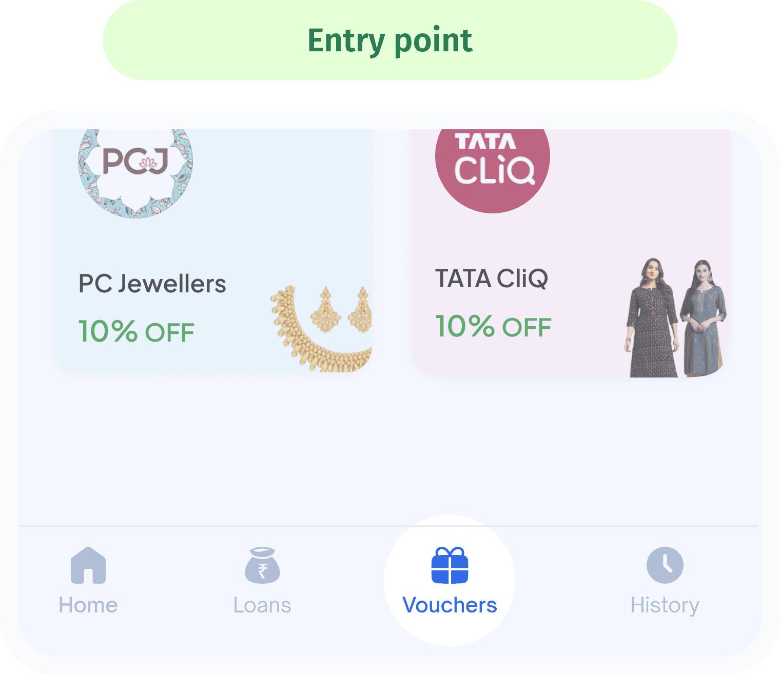
the entry point
We sought the easiest, most intuitive entry point for users to find the brand vouchers.
We placed it in the third position to balance visibility with ergonomic reach—while the last slot is thumb-friendly, the third position captures higher visual priority without compromising ease of access.
🔑
🔍
High discoverability & priority
Wanted to keep the interface easy to use and understand the for new users.
🧠
Clear mental model
Wanted to keep the interface easy to use and understand the for new users.
Primary Visual Focus
First look for the user’s eye when they land on the vouchers screen.
Sets the tone for first-time users — a key moment where their eye naturally lands. This section should feel inviting, easy to understand, and encourage users to explore vouchers and engage with the next steps
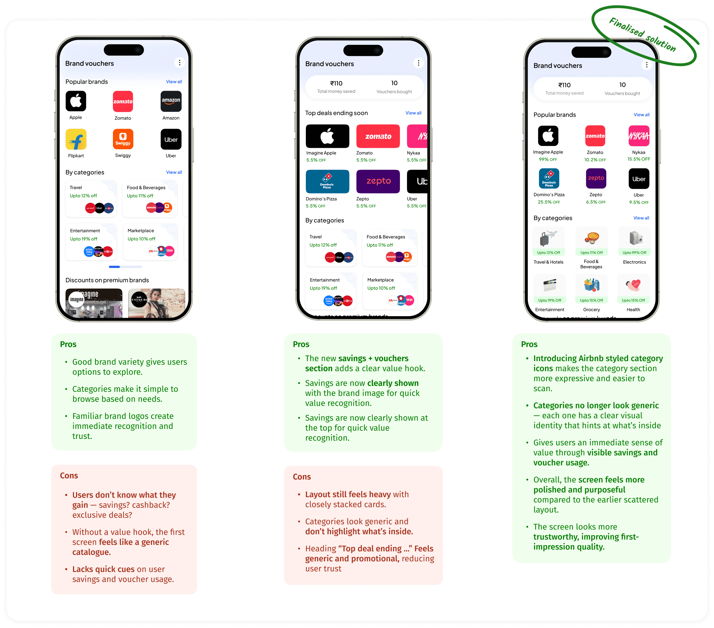
Arriving at the primary view point design
second fold
Once users land on the home screen, their scroll brings them into this second fold
This fold highlights key information at the right moment, ensuring users see meaningful voucher benefits just as their exploration begins.
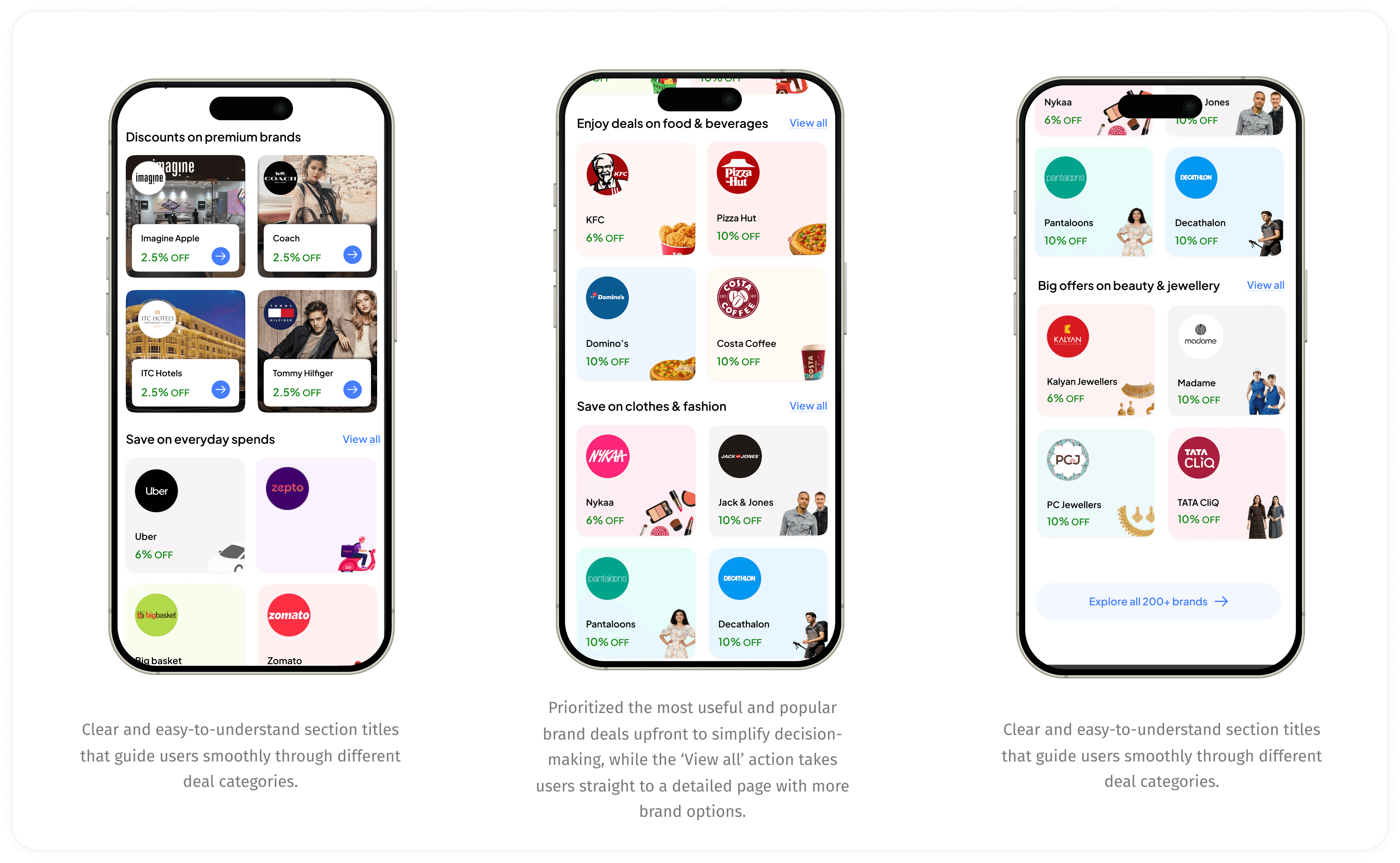
Thought process behind these designs:
🔍
Scannable, consistent card patterns
Uniform deal cards with predictable placement of logo, discount, making browsing faster and more intuitive.
📂
Adaptive category placement based on engagement
Categories reorder themselves based on what users interact with most, keeping the experience relevant.
🧩
Flexible sections aligned to user needs & brand preference
Surfaces brands and sections based on user behaviour, avoiding a fixed one-size-fits-all layout.
🔦
Progressive engagement through curated highlights
Shows top brands first to draw users in naturally before they explore the full list.
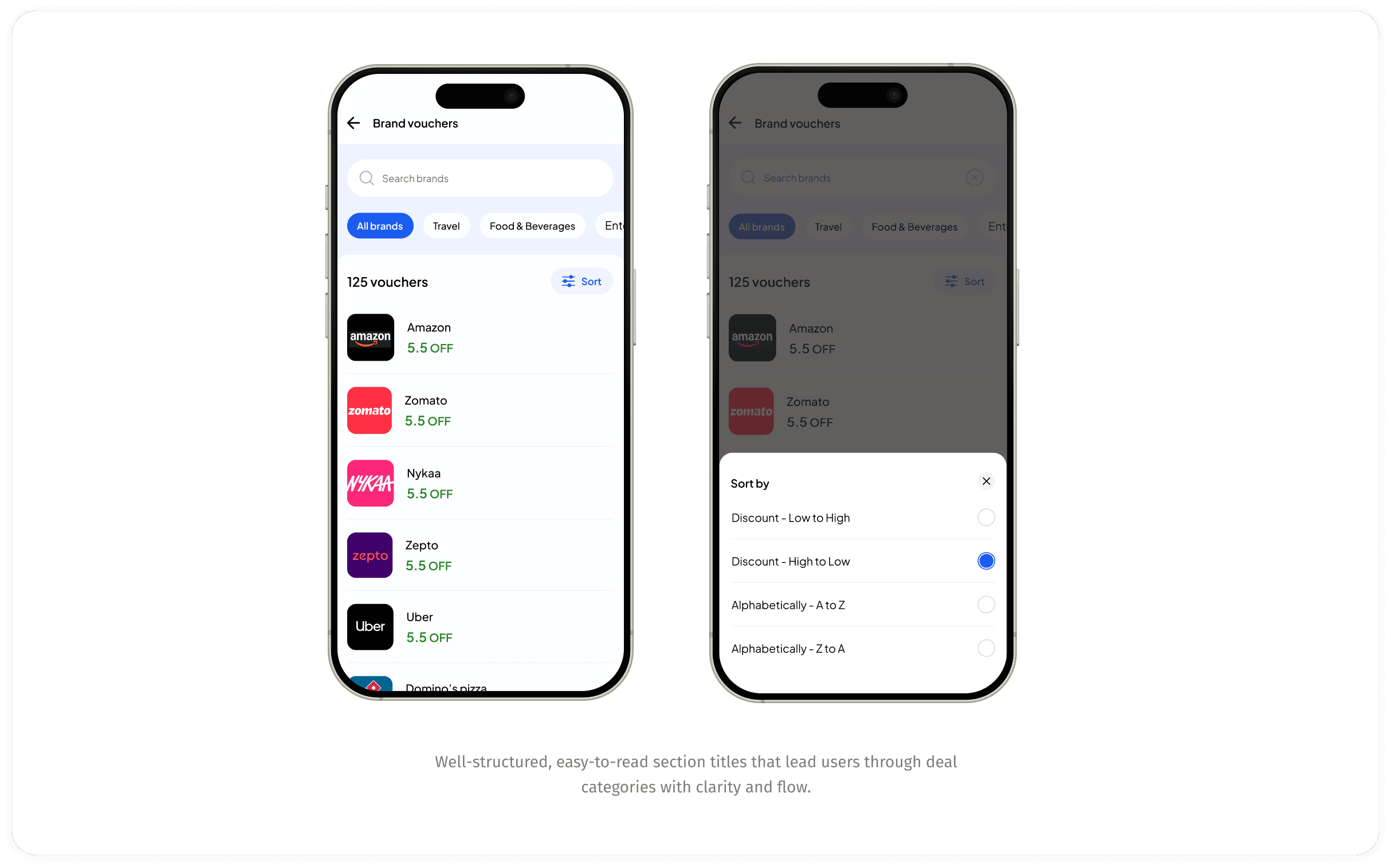
hOW DOES “VIEW ALL” WORKS
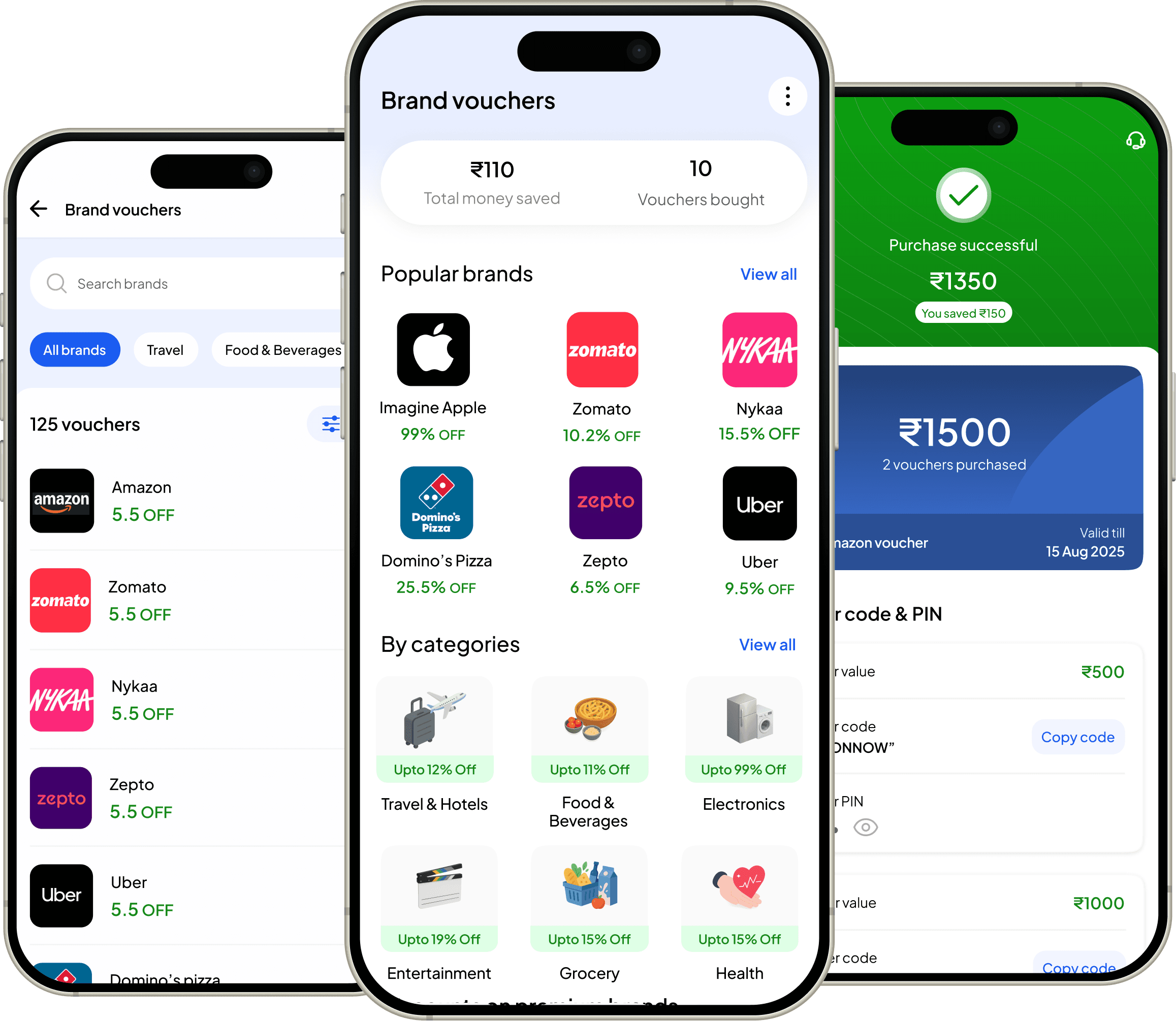
Once the user taps ‘View All’, they’re taken to a dedicated screen showcasing the complete list of vouchers.”
This screen presents all vouchers in a structured list, complete with sorting controls that help users organize deals by price, popularity, or discount value.
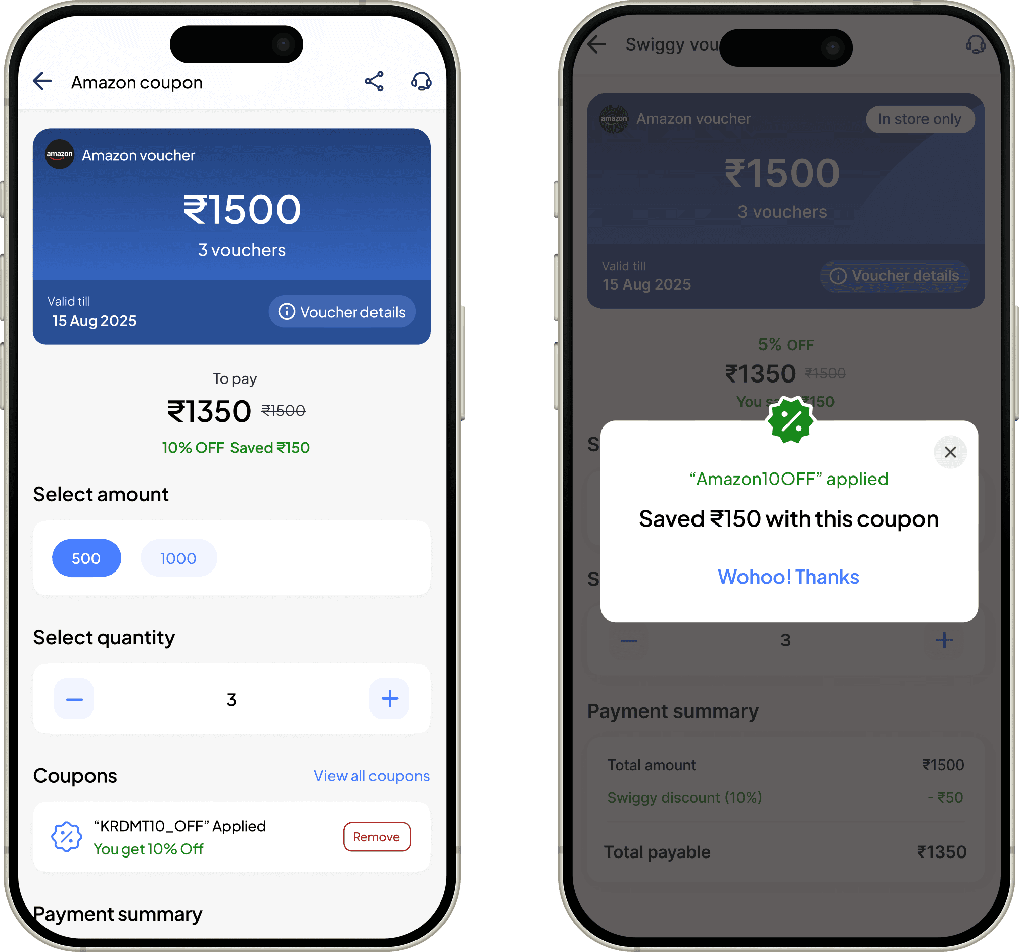
checkout screen upon clicking the voucher
Checkout screen shown after selecting a voucher, displaying applied benefits, final pricing, and a clear path to complete the purchase.
This screen presents the voucher in a card view and also mentions the amount and denomition for which the user can buy the voucher. For eg: ₹500, ₹1000.
Clean and easy to understand, according to what user might expect upon clicking the brand voucher.
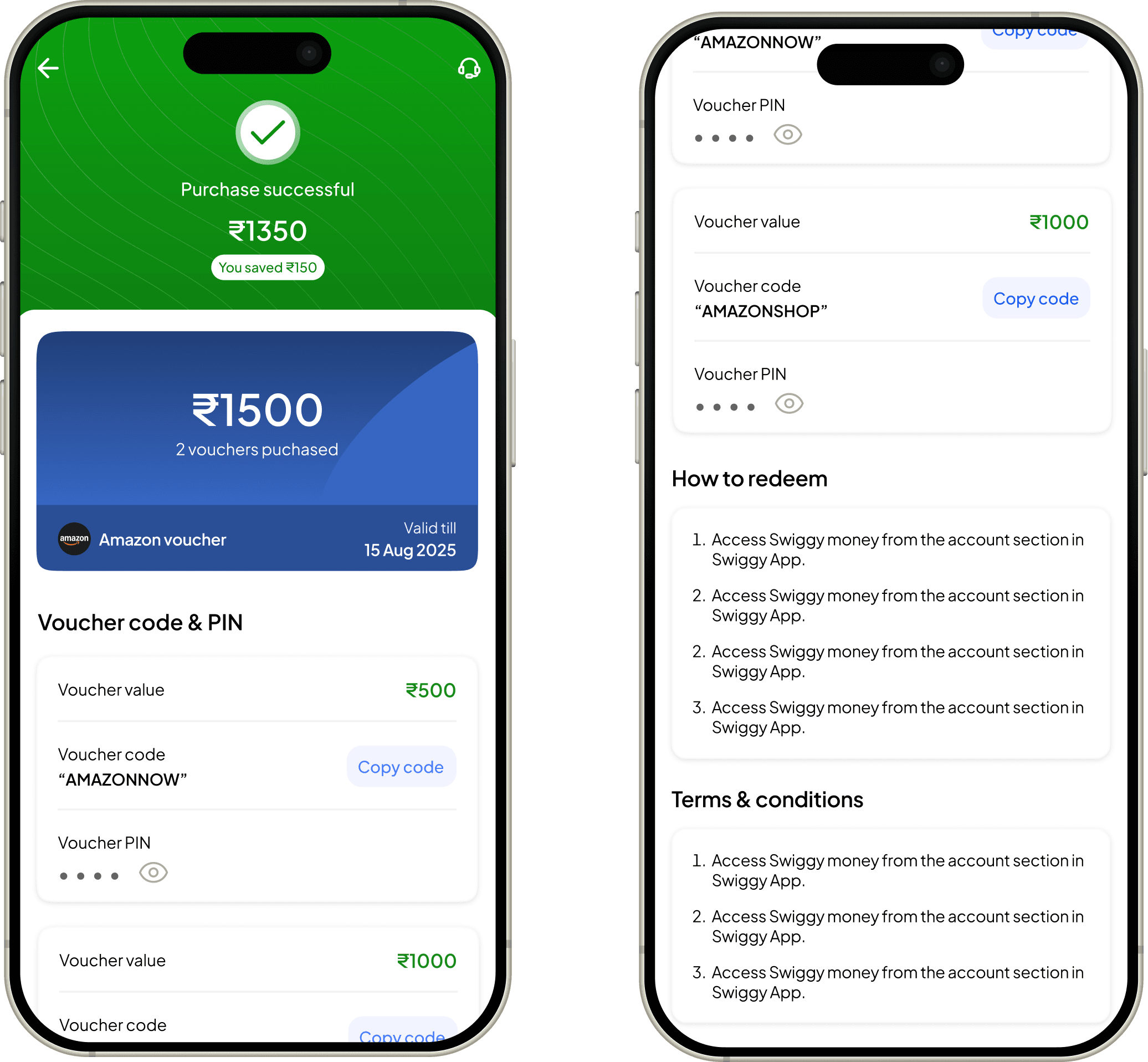
post purchase flow
The final step before purchasing the voucher
This screen presents the amount by which the voucher(s) were bought, below that the total voucher amount and validity. Plus each
voucher is given a special code and PIN to redeem them.
Easy to understand and understand all the terms and conditions and how to redeem section.
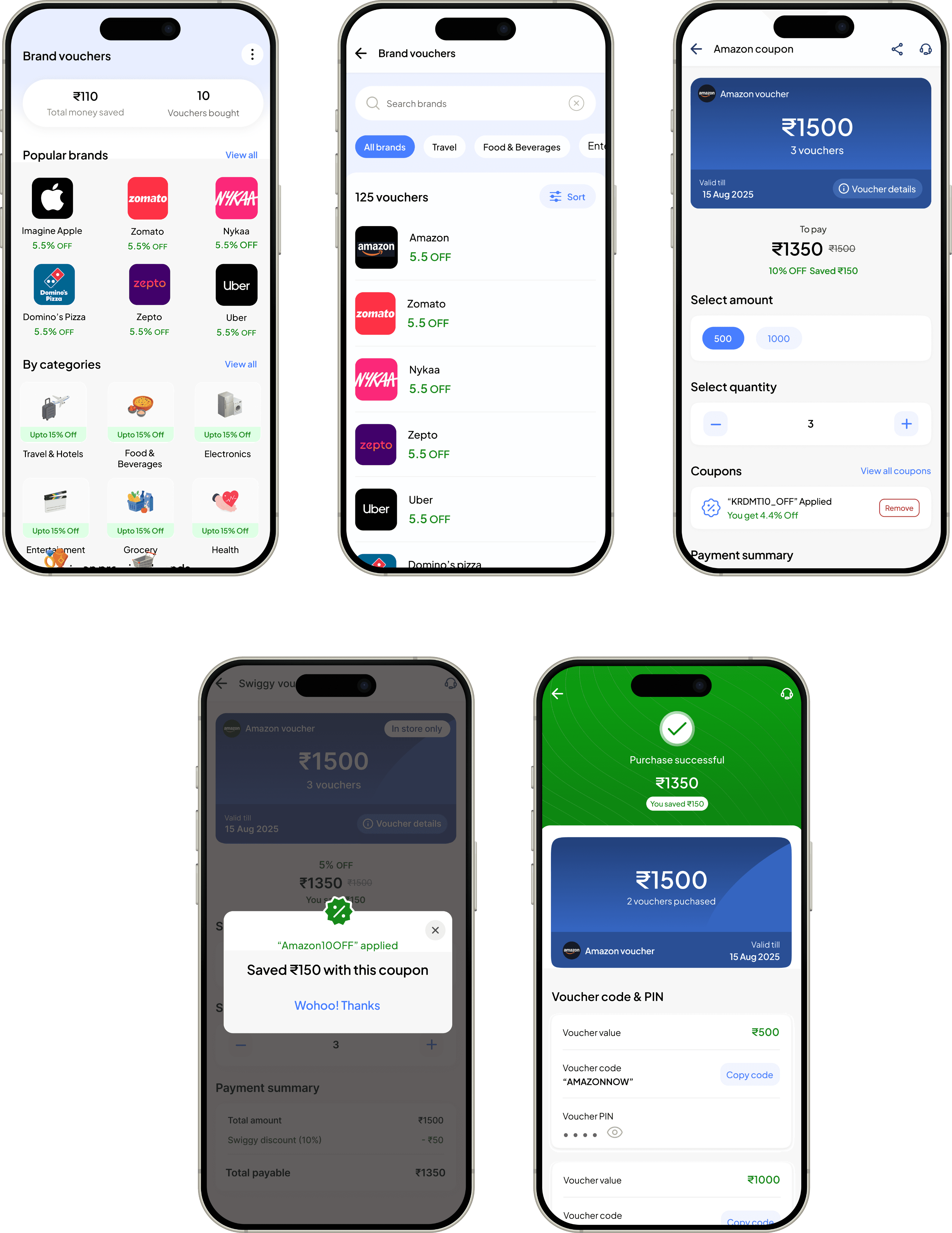
Complete flow in action
Let's see a happy flow for a new user start to end who buys a discounted brand voucher
This screen presents all vouchers in a structured list, complete with sorting controls that help users organize deals by price, popularity, or discount value.
My learnings from this project
I learned how simplifying a flow, even without removing major features, can significantly reduce confusion and help users complete actions more easily.
🌊
I understood the value of validating ideas early. Observing how users interacted with initial versions revealed patterns and barriers I wouldn’t have identified through assumptions alone
💭
️
I realized that clarity in communication—through clean layout, predictable structure, and straightforward language—has a direct impact on how confident users feel.
💎
I also learned how aligning the design with user expectations leads to more meaningful engagement.
🎨
Go back